(I had to repost this as my prezi was acting faulty)
Saturday 19 February 2011
Thursday 17 February 2011
How effective is the combination of your main product and ancillary texts?
Our ancillary texts aided our main text a lot in reaching our target audience. We produced two poster designs for bringing back hope, our main poster design of the sister (priscilla) and her diary, we decided to use for promotion on billboards, bus stops and buses, as the design was a lot more simpler and universal in the sense that it didn't give too much away about the plot.

For poster design 2, we decided this will be mainly be used for promotion online such as on social networking sites and the official websites, as it was a lot more darker themed, and gives more of an understanding of the plot. The 2nd poster was helpful in promotion amongst the youths as it provided a lot more understanding and drew up a foundation with the main character, as this is the poster she is featured in.


Wednesday 16 February 2011
Monday 14 February 2011
Thursday 27 January 2011
New music for Bringing back Hope
Gymnopedie no.1
This is the music sequence for in the beginning of bringing back hope we decided to change it because, this one felt like it suited the mood of the film more.
Sovereign
This other song called sovereign also suited the mood of the film
When The Wind Blows
Here is another song that seemed some what hopeful yet depressing, it fits the sombre mood of our film.
Feather Waltz
This was a very calming song, and could be possibly used for the transition into the flashback scenes.
Friday 26 November 2010
Poster ideas
1.

If this poster is picked the font and title need to be much larger, yet simple, to focus on the seriousness of the drama, as it deals with despair and death.

This was actually the last idea I came up with. In this poster idea, the sister is holding her own Diary, she is in black and white while the diary is in color. I decided to have her in black and white to represent how she is something from the past, and is no longer alive.
However with the diary in color as this is the thing that brings back hope to Hope, and is something in the present and is still a part of her sister that is living, and helps her, as the story focuses on the diary, having it in color puts a greater emphasize on it, and hits to the audience straight away that the diary plays a major role within the story.
This one out of the 3 is my favourite, as it is simple, and gets the message across well, without having to show too much.
The font would be bold and sans serif, but for the name hope it would be curvaceous.
We won't be abe to see the sisters face, creating a shroud of mystery amongst the audience, and they will feel more inclined to want to find out who she is.
3.

This idea was originally my first, I have the character hope, looking more hopeful and gazing out of the window, and below her sister holding the necklace, that hope gave her for her birthday, but we do not see the sisters face, once again, to give a bit of mystery as to who she is, and make the potential audience question what her role i and as she is in the poster plays she definitely plays an important role.
However, having the heart necklace in it could imply straight away that it is more of a romance rather than a drama about two sisters and doesn't imply enough of something upsetting happening within the story, but rather to lovers/ people who were separated and are trying to find their way back to each other, especially when followed by the title, "Bringing Back Hope".
Tuesday 23 November 2010
Analysis of film poster
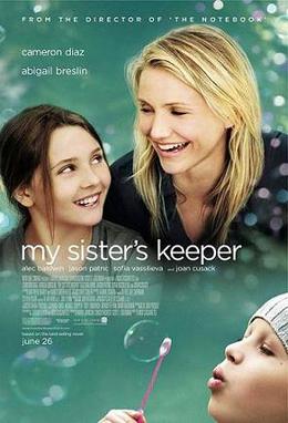
My sister's keeper (2009) is an american drama, based on a novel about a 13 year old girl called Anna who sues her parents for medical emancipation, when she is expected to donate her kidney to her sister kate who is suffering from luekemia.
In the poster above, we have a two shot of both sisters in the forground at the top, smiling hapily, meaning that both sisters are close and enjoy their time together, there is this type of bubble effect around them that could represent something being of a dreamy state or a wish, like a moment that is very magical, especially with the turquoise background that further gives a more calming state.
The bottom half of the poster has the younger sister, at a sicker state blowing bubbles that leads upwards further implying that hr relationship with her sister is but a dream, or a wish.
Subscribe to:
Posts (Atom)